Always New York.
Always Wilson.
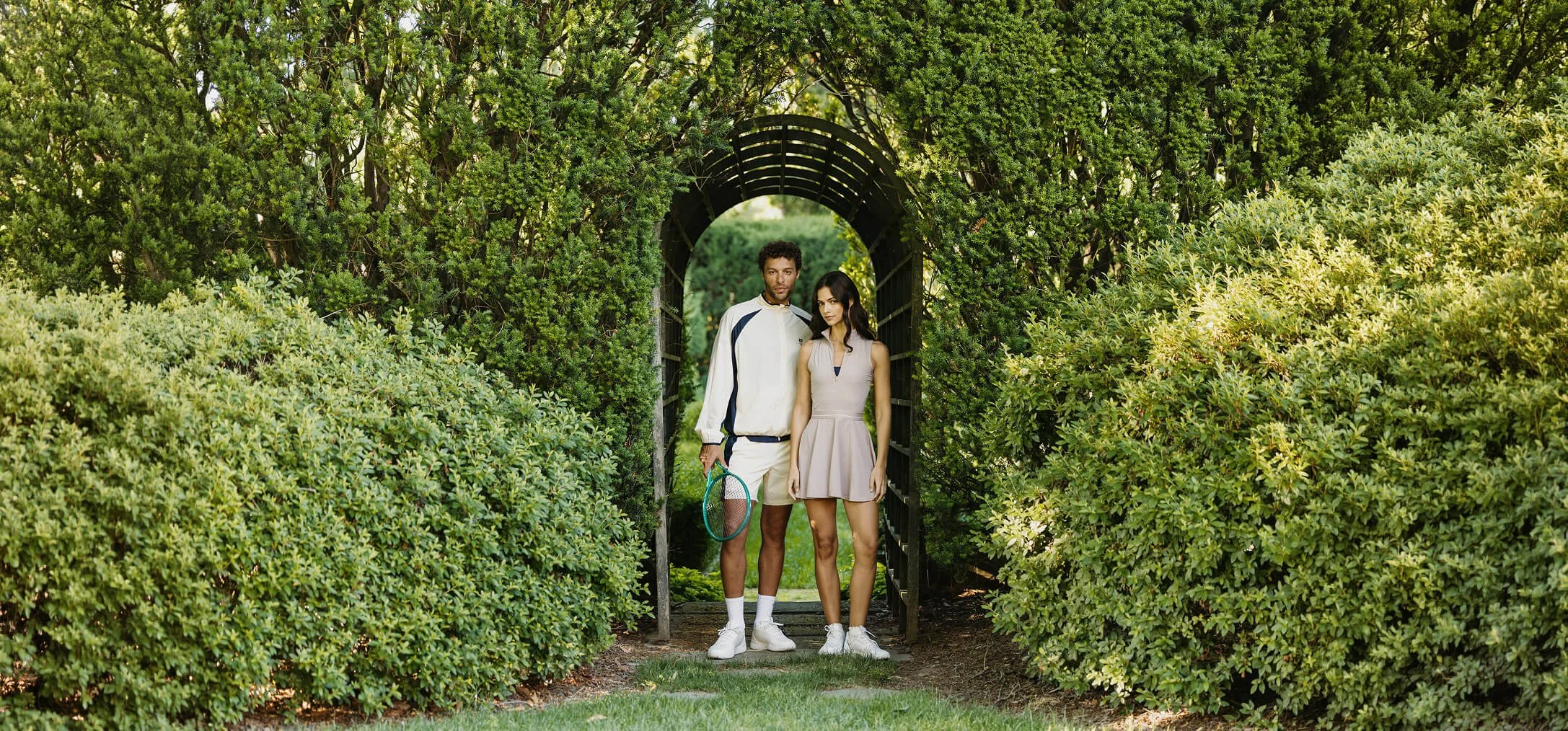
It’s summer in the city. The hard courts are sizzling and tennis is coming home to the US. Match the energy. August 6. Hard courts, electric nights, summer in the city. This collection celebrates tennis's US homecoming; fusing heritage graphics & classic colors with modern tech knits & sweat-defying, featherlight fits.
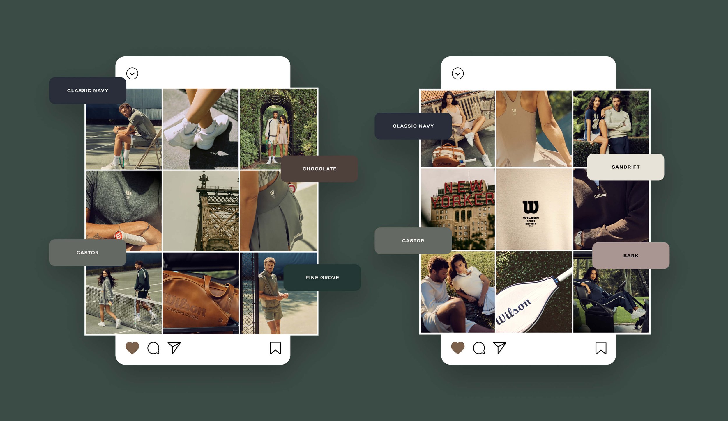
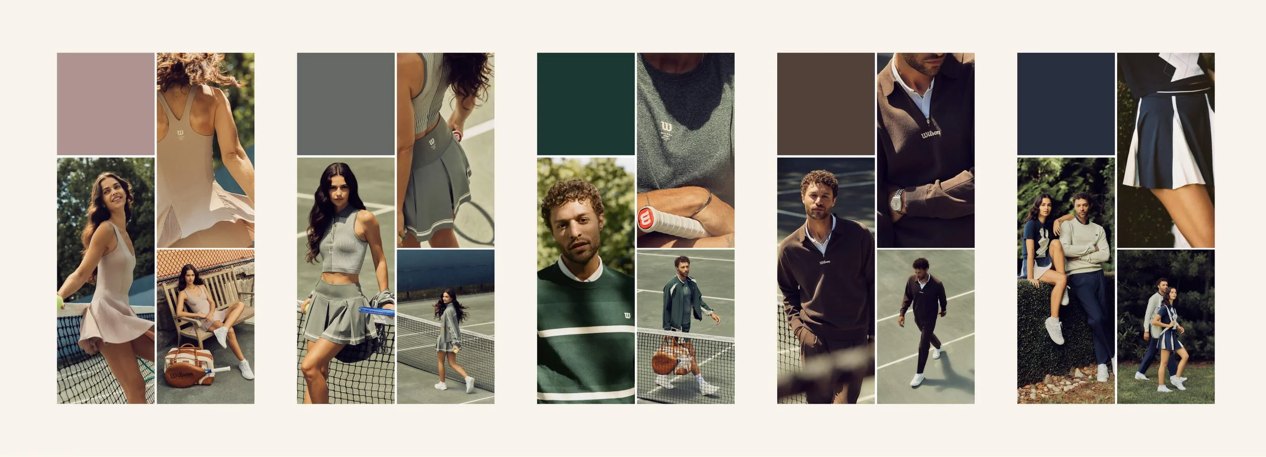
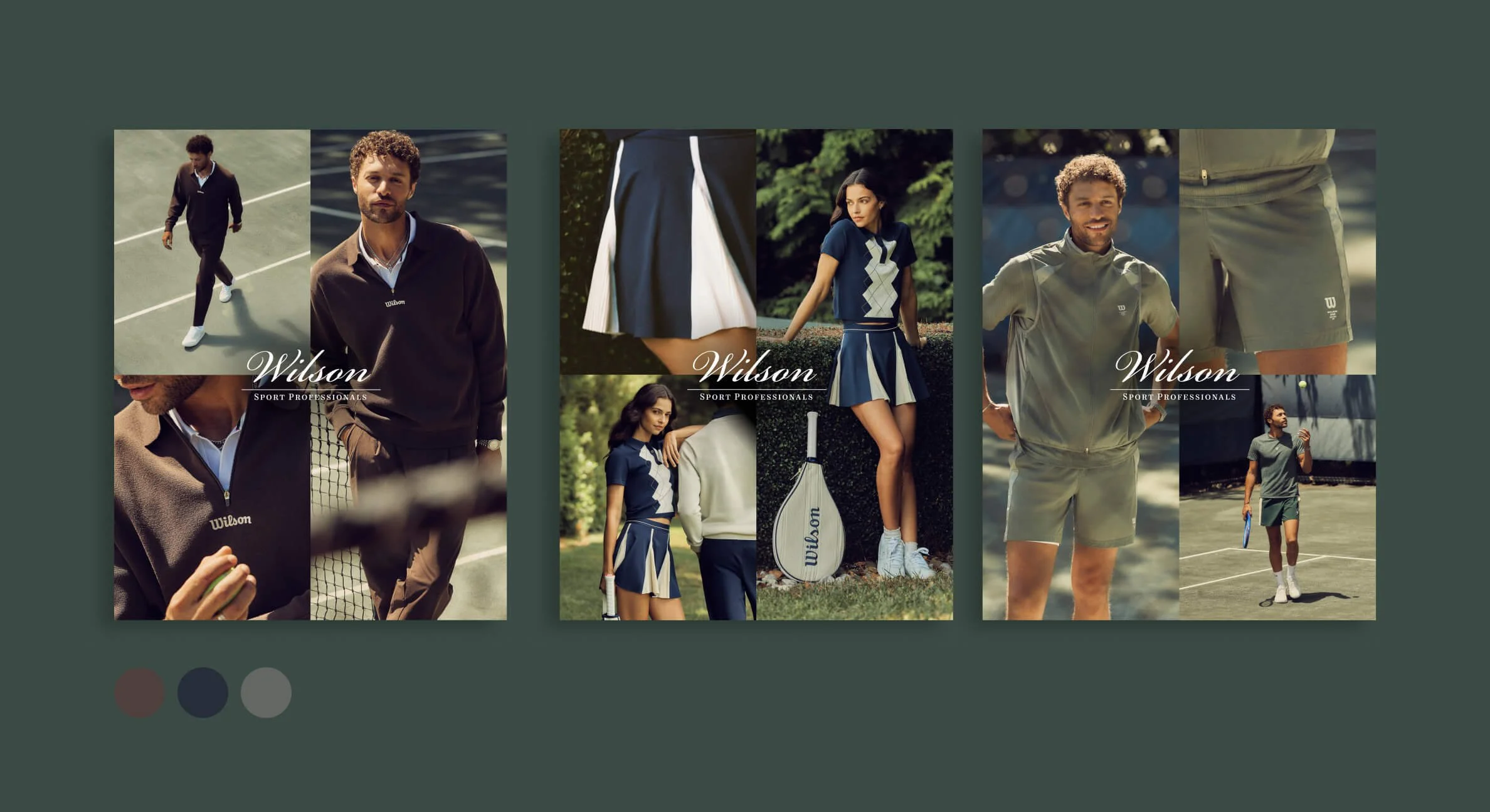
Color Story Asset Design
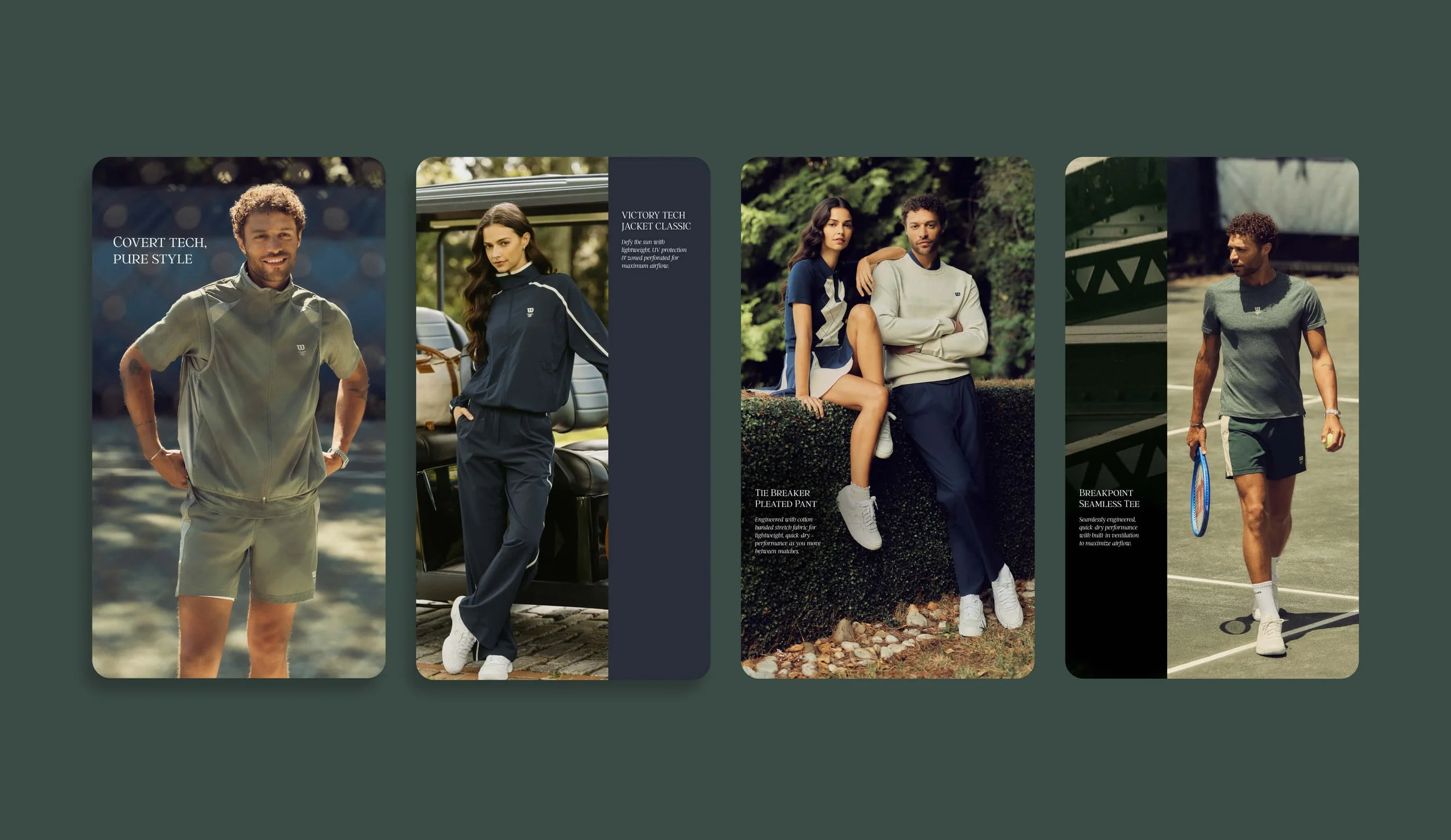
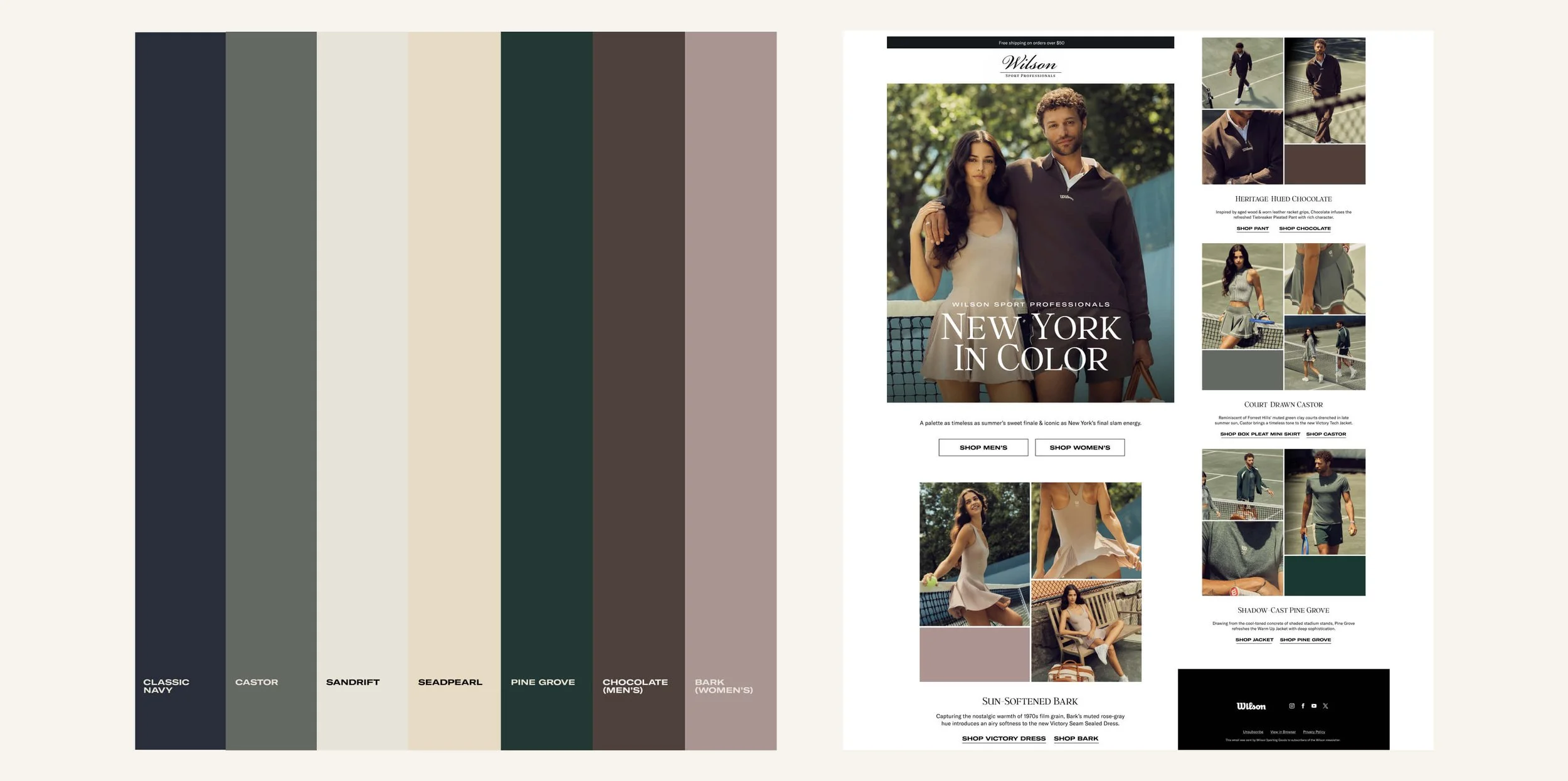
Designed digital marketing assets that translated Wilson's seasonal color story into cohesive visual experiences across channels. Developed layouts and social-first content that highlighted the intended palette, ensuring every asset reinforced the collection's narrative and maintained consistency across the campaign.
Context Through Composition
Subtle New York skyline overlays and analog-inspired film grain were introduced to evoke the atmosphere of the city's iconic tennis tournaments. These layered treatments add depth, reinforce the campaign narrative, and connect the collection to the heritage of classic New York tennis.
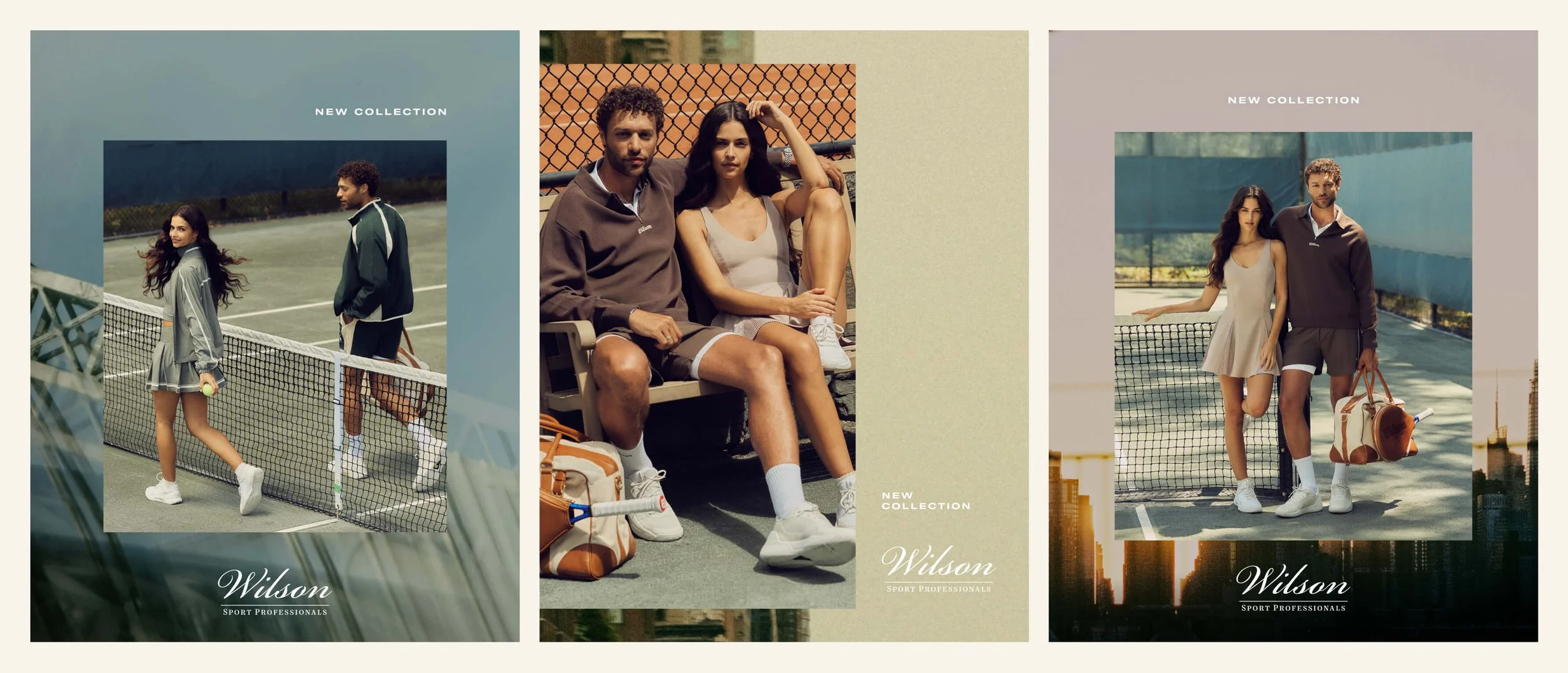
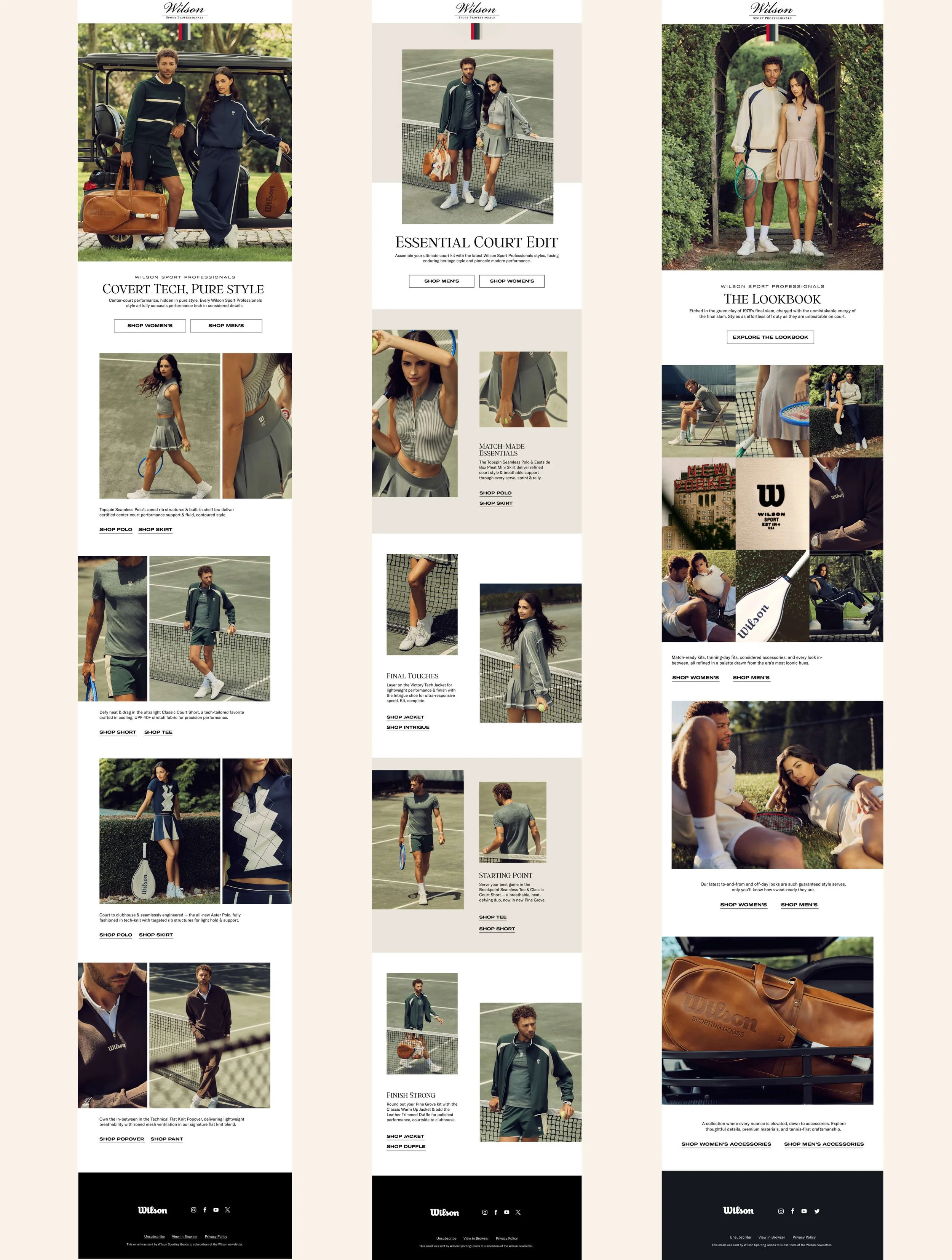
The visual language developed across the campaign extended seamlessly into email, translating the collection’s color story, layered imagery, and editorial composition into a cohesive digital experience. Each email uses considered image framing, typography, and negative space to create hierarchy while carrying the same sense of heritage, place, and modern performance across the customer journey.